Product detail page best practices + Bonus 7 PDP tips
In the State of Commerce 2021 report, Catalyst and Kantar emphasized that “product detail pages (PDPs) are one of the most critical elements of a brand’s eCommerce presence and yield significant influence over shopper purchase decisions.”
According to their study, 45% of online shoppers visited a PDP at the time of purchase. Among those ranked any touchpoint as #1, 41% said PDPs had the biggest influence on their purchase.
Unfortunately, not all brands understand the importance of PDPs. “Millions of dollars are spent on the brand’s website, but only a small fraction on the PDP, but it should be the opposite,” Rob Gonzalez, Salsify chief marketing officer and co-founder, said.
If you fall into this group and don’t know how to optimize your PDPs for conversions, then you’re in for a treat.
In this article, you’ll find 10 best practices and a checklist to create high-converting PDPs, which can help skyrocket your sales in a way you may not imagine. Frontier Blades did that, and their conversation rate increased 21% year-over-year—to 1.40% from 1.16%.
That’s amazing, right?
Alright, let’s dive in.
Updated on 14 Jun 2024
How to build a product detail page that converts
1. Write a “show, don’t tell” product description
Product description gives customers information about your product, what it is, and how it solves their problems. That’s why it has a huge impact on customers’ buying decisions. A product detail page is powerful when done right. However, too often retailers miss out on crucial details needed to convince and convert customers.
According to Periscope and McKinsey’s Retail reimagined: The new era for customer experience report, due to the Covid-19 pandemic, product description becomes much more important than ever. Since people can’t go to physical stores to see products, they rely heavily on product images and complete product details on retail websites to decide what to buy.
“The need for informative product descriptions and clear product images at a time when consumers couldn’t see, feel or test products in a store ranked as one of the top three factors for a great online browsing experience in all the countries we surveyed, increasing in importance by 12 to 23% from pre- to post-shutdown,” the report says.
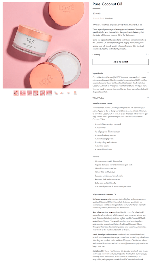
Tips for writing compelling product description:
- Write short words, sentences, and paragraphs.
- Use specific and active language.
- Use subheadings, bulleted or numbered lists, white space, and highlight key points to increase readability and make it easier for shoppers to scan information.
- Provide sufficient information about your product, including specifications, source of materials or ingredients, how to use, etc. Show features along with benefits. Ensure this information is accurate, up to date and flexible to accommodate the needs of different customers on your site. For instance, if you’re selling clothing, this size chart app lets you succinctly showcase different variations of the same product without cluttering the page with too much information at one time.
- Use storytelling to tell a story about your product and convey emotions, which helps increase the perceived value of products.
Case in point:
2. Use enhanced content to showcase your products
Enhanced content (or rich media) refers to high-quality images, videos, chart comparisons, 360 spins, visual graphics, or interactive content—it goes beyond regular product images. Enhanced content is widely used in many industries like CPG, consumer electronics, hardware, home appliances, furniture, and clothing.
Showing enhanced content on PDPs is a great way to make your products stand out, provide a better shopping experience, and improve conversions. For example, Amazon A+ content increased sales by 10%. Rich content also helps Walmart convert up to 12-36% more frequently.
Here is a good example of using enhanced content on PDPs from Lowes.
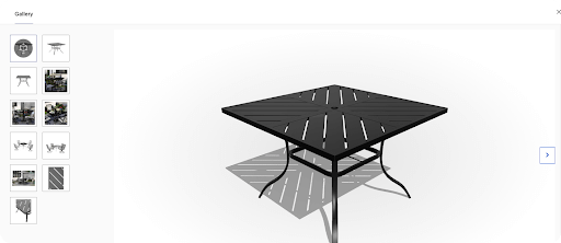
Tips for creating the best product pages with enhanced content:
- Use product photography, video tools, or enhanced content solutions to create high-quality visuals for your products. Incorporate an auto video maker to effortlessly generate engaging product videos that showcase your items in action, enhancing the overall shopping experience for your customers.
- One way to achieve this can be through advanced tools like Picsart, which allows you to experience AI photo editing to generate high-quality visuals, adding extra depth and detail to your product images.
- Reduce bytes for visual content across desktop, mobile, and apps for faster site loading speed, which leads to better site performance and higher customer engagement.
- Create different types of enhanced content and do multiple tests to decide which content brings optimal results.
3. Make your call to action button jump off the product detail page
A call to action (CTA) button indicates a message designed to prompt immediate action.
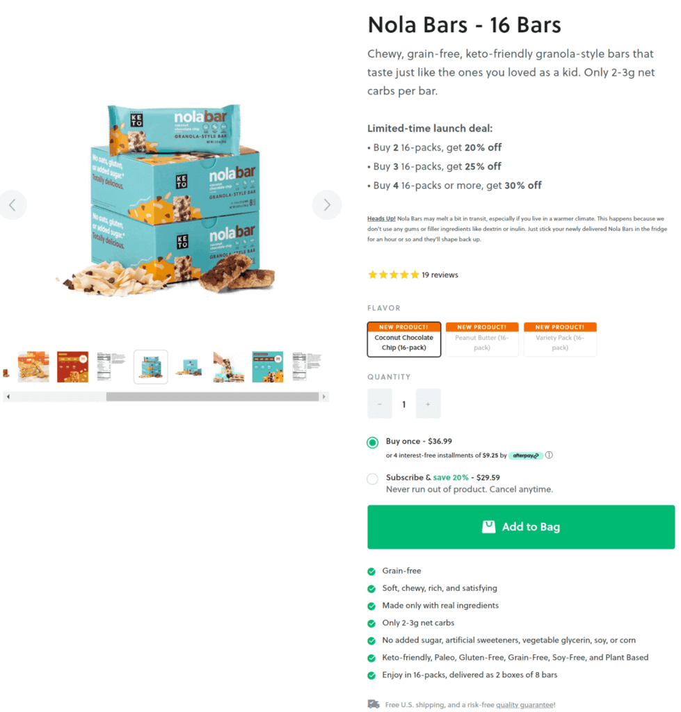
On PDPs, a typical CTA button is “Add to Cart” or “Add to Bag.” But since Shopify introduced the dynamic checkout button, some online stores show another CTA like “Buy It Now” or “Buy Now” or “Checkout Now.”
Adding a dynamic checkout button to your PDPs is a smart tactic because it allows shoppers to skip the cart and quickly buy the product they’re viewing. The caveat is you can’t upsell, and shoppers may find it hard to buy more than one item per order.
Tips for creating a call to action button that works:
- Choose a color and contrast that is compelling to your target customers. It can be red, green, or any color.
- Use directional cues like a shopping cart icon or arrow icon to capture attention.
- Place the CTA above the fold alongside the item price.
- Ensure your button is large enough and has adequate space.
- Use a proper shape to ensure your button looks like a button.
Case in point:
4. Offer personalized product recommendations
According to RILA and Accenture’s Delivering For The New Consumer report, 63% of consumers are interested in personalized recommendations.
The reason is understandable: we all have time constraints — we don’t have enough time to spend hours just finding a product. What’s more, with many choices out there, it’s not easy to find the exact item we’re looking for. Because of that, we may end up buying an item with a high level of cognitive dissonance or not purchasing at all.
That’s why providing personalized product recommendations will help you get more customers and drive more sales. For e-commerce platforms specializing in automotive parts and accessories, providing detailed fitment data directly on your product detail pages enhances user experience remarkably. Utilizing top Shopify fitment apps can help you streamline this process by ensuring customers find the right parts for their specific vehicle model and year, effectively reducing returns and increasing satisfaction. When optimizing PDPs for conversions, considering such specialized features becomes fundamental.
According to Barilliance, “personalized product recommendations induce more conversions, as customers who click on the product recommendations have a 5.5 times higher conversion rate than those who do not. Overall, the personalized product recommendations account for 12% of total revenues.”
For example, using Insider’s AI-powered product recommendation solution, Maty drove a 6.69% uplift in Average Order Value (AOV) and a 9.69% uplift in incremental revenue. Avon achieved the same results with our smart recommendations — their AOV increased by 11% and click-through rate by 13%.
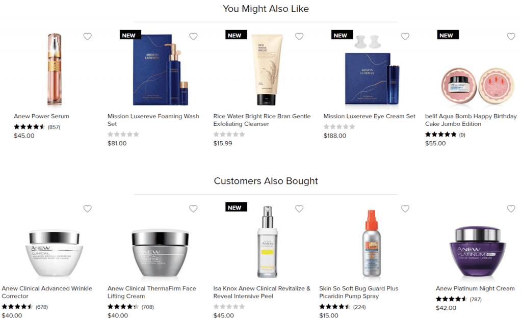
Tips for personalizing product recommendations on PDPs:
- Use different types of product recommendations like new arrivals, best sellers, top reviewed/top rated, similar items, recently viewed, etc.
- Take advantage of seasonality and buying trends, for example, “Mother’s Day Gift Ideas” or “Trending Now.”
- Create specific product recommendations for first-time visitors.
- Show reviews, ratings, and prices for product recommendations.
5. Make it easier for customers to compare products
Customers will compare products or prices when shopping. So you should allow them to do that well on your online store, especially on PDPs. That way, your customers can know if the product they’re viewing is the best choice or they should switch to another option.
With Insider’s Web Versus solution, you can provide shoppers an easy way to find and compare products from their past browsing behavior.
Here is a good example from FashionValet:
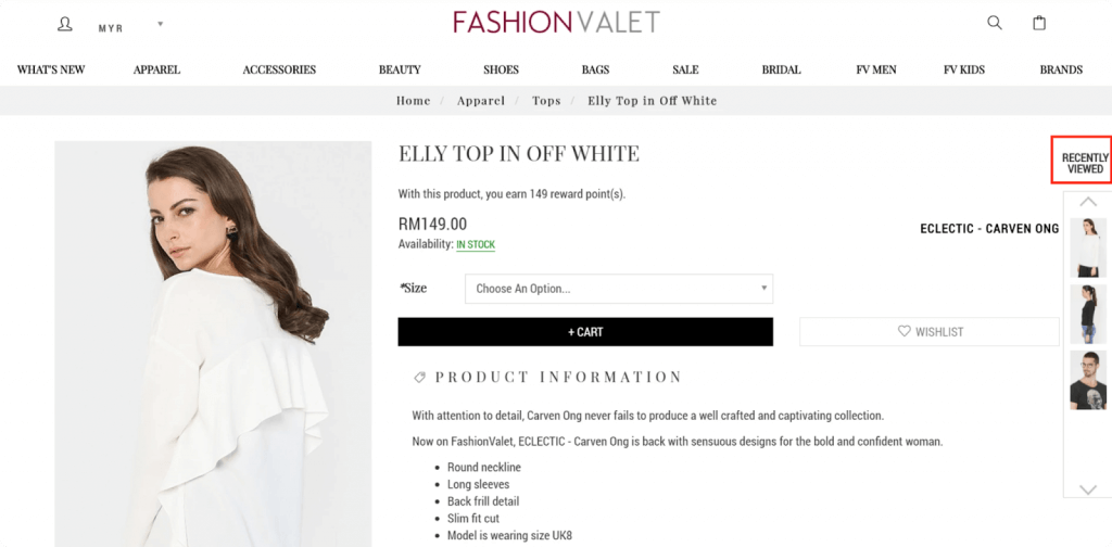
Another way to show product comparison is showing a table as Leesa does below:

Tips for creating product comparison on PDPs:
- Display the “Compare Product” button above the fold. Don’t make shoppers scroll down to the bottom to find the button.
- Show images, product names, prices, and the “Add to Cart” button for each compared product.
- Ensure each product image or product name is clickable, leading shoppers into the corresponding product page.
- Create a well-designed product comparison layout to draw attention. Use sliders and arrows to indicate there are many products to compare.
- Show product comparison right on the current product detail page — avoid directing shoppers to a new page.
6. Use social proof to build trust with shoppers and boost purchases
Social proof indicates ratings and reviews, testimonials, press logos, number of recent purchases, case studies, etc. Social proof works because we’re influenced by others’ opinions. If our friends or someone we admire trusts something, we’re more likely to trust it as well.
According to PowerReviews’ research, using social proof is great for increasing customers’ trust and driving sales:
- 97% of consumers typically read product ratings and reviews before making a purchase.
- 81% of all online purchases occur on product pages with ratings and reviews.
- 72% of all product page traffic occurs on PDPs with ratings and reviews content.
- Displaying ratings and reviews on PDPs can lift conversions by up to 115%.
Yves Rocher, a leading French plant-based cosmetics and beauty brand, is an excellent example of using reviews to boost sales. Using Insider’s social proof solution, the brand increased conversion rates by 4.49%.
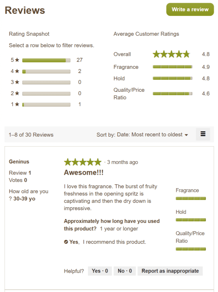
Here is another example from Eight Vape:
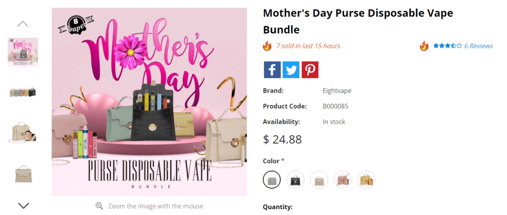
Tips for using social proof to have the best product page designs:
- Display review snippet — a product’s review rating and volume — at the top of the product page, above the fold.
- Display a visual overview of the review content for a product, including average star rating and rating distribution.
- Include search and filter options so shoppers can find reviews that are most relevant to them.
- Show verified buyer badges to indicate reviews that were written by someone who actually purchased the product.
- Don’t hide negative reviews because 82% of consumers specifically seek out these reviews. Negative reviews and low ratings help inform shoppers’ purchasing decisions and remove barriers and hesitations they might have had previously.
- Include photos and videos from shoppers in reviews to strengthen customers’ trust.
7. Include a FAQ section to remove doubts and second thoughts
A frequently asked questions (FAQ) section isn’t just there to address common questions about a given product, but it’s also effective to remove doubts, build trust, and delight customers.
And guess what? When your customers have the answers they need, the high chance is that they’ll make a purchase.
To create FAQs, think about common questions your customers may have when shopping online or buying the product type you’re selling. For example, return policies, shipping options, taxes, and order issues are common problems.
Case in point:
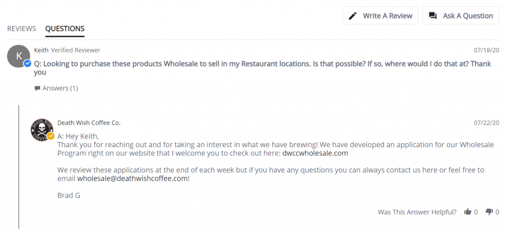
Tips for showing FAQ on PDPs:
- Make FAQ a part of your product description or post it towards the bottom of the page, near customer reviews.
- Write questions from your customer’s perspective (e.g., “Where is my order?”) and answer from your business’s perspective (e.g., “You will…” or “We provide…).
- Use visuals when necessary to supplement your answers.
- Use questions asked by your previous customers to create a FAQ. PowerReviews found that customers who interact with user-generated FAQs are 153% more likely to convert.
8. Use trust badges to establish credibility
Concerns about security and payment are one of the top reasons for high abandoned carts. Brands often use trust badges to solve this problem.
Trust badges are a type of social proof typically shown during the checkout process. However, more and more retailers are placing them on their PDPs as well to instill shoppers’ trust.
According to Bill Joseph, founder of Frontier Blades, “trust badges can propel indecisive customers to lean towards making a purchase because it gives them a sense of contentment with any payment security concerns.”
Here is a good example from Avocado Green Mattress:
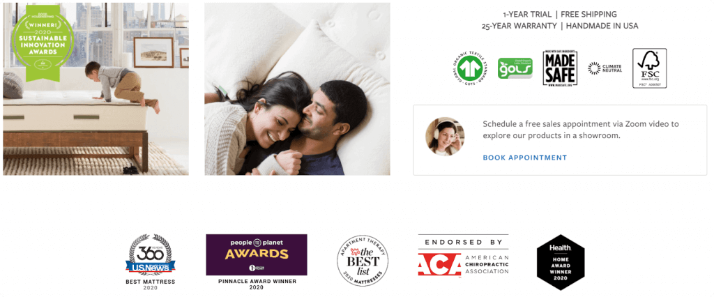
Tips for showing trust badges on PDPs:
- Use different types of trust badges, for example, safe checkout badges, accepted payment badges, third-party endorsements, money-backed guarantee badges, and free shipping and returns badges.
- Use badges released by well-known providers so your customers can easily recognize them. Familiar brands like Visa, Mastercard, PayPal, and Norton are the most trusted seals when paying online.
9. Use urgency and scarcity to drive customers to buy
Last chance, low in stock, X left, almost gone, today-only offer, or limited-time sales — if you’re an avid online shopper, you may have seen these words many times.
Case in point:
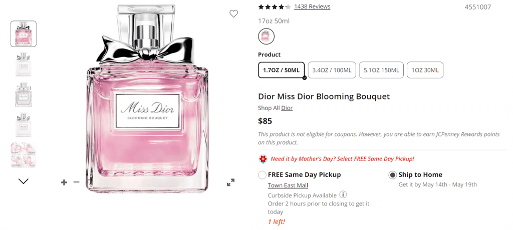
That’s scarcity and urgency marketing.
In a case study, CXL added urgency to a PDP and got a 17.1% revenue lift. A split test also showed that when a countdown timer was placed on a PDP, it converted nearly 9% better than when no countdown timer is displayed.
So, why do urgency and scarcity work?
It’s because, as human beings, we procrastinate and tend to delay our decisions to buy. According to a study done by Centre De Recherche DMSP, consumers that were seen as high procrastinators had a 73% chance to not buy immediately. Consumers that were determined to be low procrastinators still had a 26% chance.
But when we know we’re about to lose something, we’ll take action to get it as quickly as possible. We don’t want to miss out on a good opportunity.
Tips for apply urgency and scarcity marketing to create PDPs:
- Offer very limited-time discounts on hand-selected products.
- Include a countdown timer or a stock countdown.
- Create time-sensitive free shipping.
- Show the number of products left in stock.
- Create urgency in product description by using words like “they’re going quick,” “supply is limited,” “deal will end in one hour.”
10. Bundle products to boost average order value
Another great way to increase conversion rates and average order value (AOV) is product bundling.
A product bundle is a curated collection of complementary products that can be purchased together.
Here is an excellent example from VaporDNA:
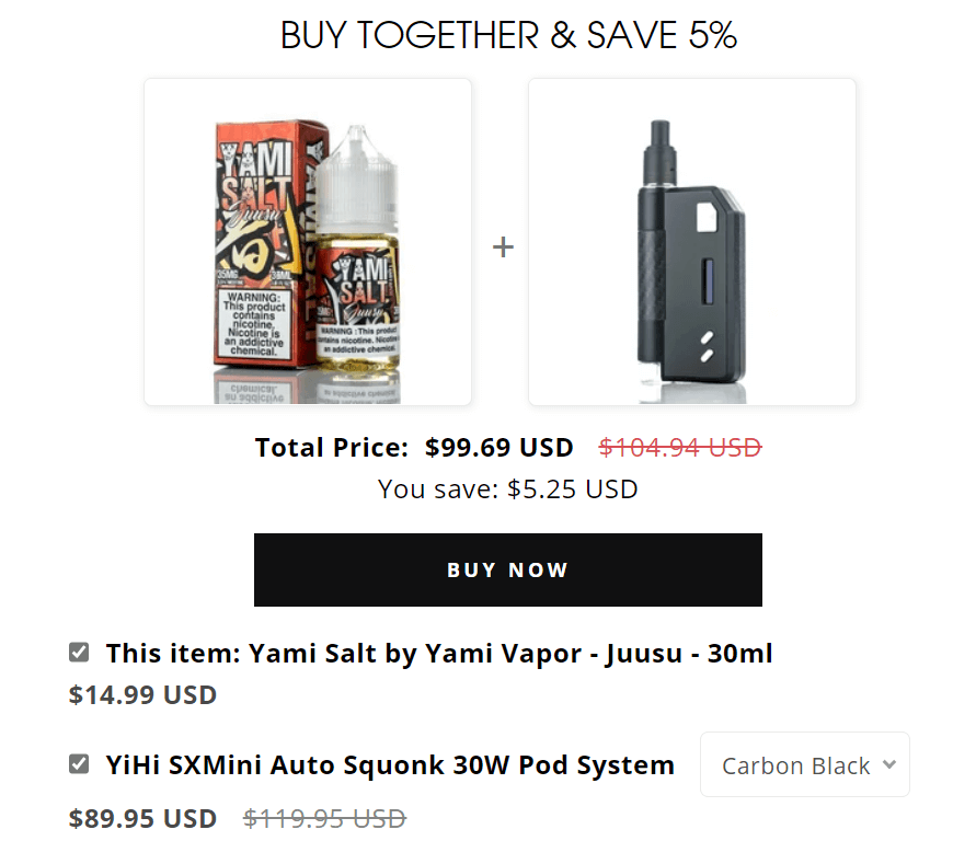
According to Shopify, product bundles brought great results for many brands:
- Hydrant raised its total sales by about 40% when it introduced product bundles.
- HVMN’s AOV shot up 111% when it started offering mix-and-match bundles.
- Doe Lashes saw a 86% increase in AOV after launching bundles.
Tips for making product bundling work for your business:
- Decide which bundles help you achieve your goal. You can create quantity discount bundles, buy-X-get-Y bundles, subscription boxes, etc.
- Be creative when naming your product bundle to draw attention to your offering.
- Display your bundle above the add-to-cart button and make the discount information prominent.
Product Detail Page Design Bonus Tips
Use the checklist below to create the best product page designs for your online store. Check off everything you’re currently working on, and then you’ll see how good or bad your PDPs are.
- Responsive product pages.
- A clear, benefit-oriented product description above the fold.
- Short sentences, short paragraphs, bullet points.
- Product dimensions and specifications listed.
- Simple background for product pictures.
- High-quality images, videos, and other enhanced content for products.
- Zoom magnifier enabled.
- A “wish list” or “favorites” button available.
- A “find in store” CTA if in-store pickup is offered.
- Eye-catching add to cart button.
- Reviews and FAQ section.
- Urgency and scarcity, trust badges applied.
- Product recommendations and bundles.
Exclusive Bonus: Bring your PDPs to a higher level of success! Click here to get 7 more useful design tips and see your sales skyrocket.
It’s Time To Review and Revamp Your Product Detail Page
Approximately 69% of shoppers will abandon product detail pages that lack information. No doubt, these pages can make or break your business.
With this guide, you’ve learned 10 best practices to create killer PDPs. Try all of them and do multiple A/B tests until you find ones that help achieve your desired results.
Don’t forget to follow us on LinkedIn and Twitter for more advice about conversion optimization and customer experience.

