Quieter permission UI for web push: Everything you need to know
Since its inception in 2012 when Google launched Chrome 42, web push notifications have been at the forefront of growing digital-first businesses. Google recently made it to the news with its latest developments and planned feature releases for Chrome 80. Chrome is braced to release a crucial update early next month which will change the course for most businesses. Early this month Google Chrome released a blog with the first looks of this new update known as “Quieter Permission UI for Notifications”. This update promises to make browsing the web seamless and less annoying for the users.
Updated on Jan 17, 2020
The goal of this new update is to improve users’ browsing experience and reduce the frequent blast of notification permission requests. It also revolves around tackling the trend where users are prompted to allow on the first visit rather than at contextually relevant moments in a user’s journey.
What will change with Quieter Permission UI?
Before we get into the question of how this feature impacts your website users and your marketing efforts, let’s take a closer look at what these changes are and how they look like. While all browsers seem to be moving in a similar direction, we are specifically covering Google Chrome and Firefox in this blog post.
Google Chrome
Here’s a before and after effect of the quieter UI
Before the update:
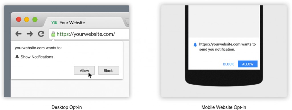
Whenever a user visits your website a default notification subscription form appears. It disappears only after clicking “Allow” / “Block” or by closing the permission screen. If the user clicks “Allow”, he’ll automatically join the group of web push notification subscribers of your website. If he clicks “Block”, the opt-in screen will disappear and will never be shown again. In order to get opt-in, the user has to manually click the lock icon and select “Allow” and reload the website.
After the update:
With the new quieter UI update, whenever a new user visits your website and meets certain criteria (more on that later!), the default opt-in screen will no longer be prompted. Instead, the first time the UI is presented to the user, it will be accompanied by a dismissable in-product help dialog that explains the new feature.
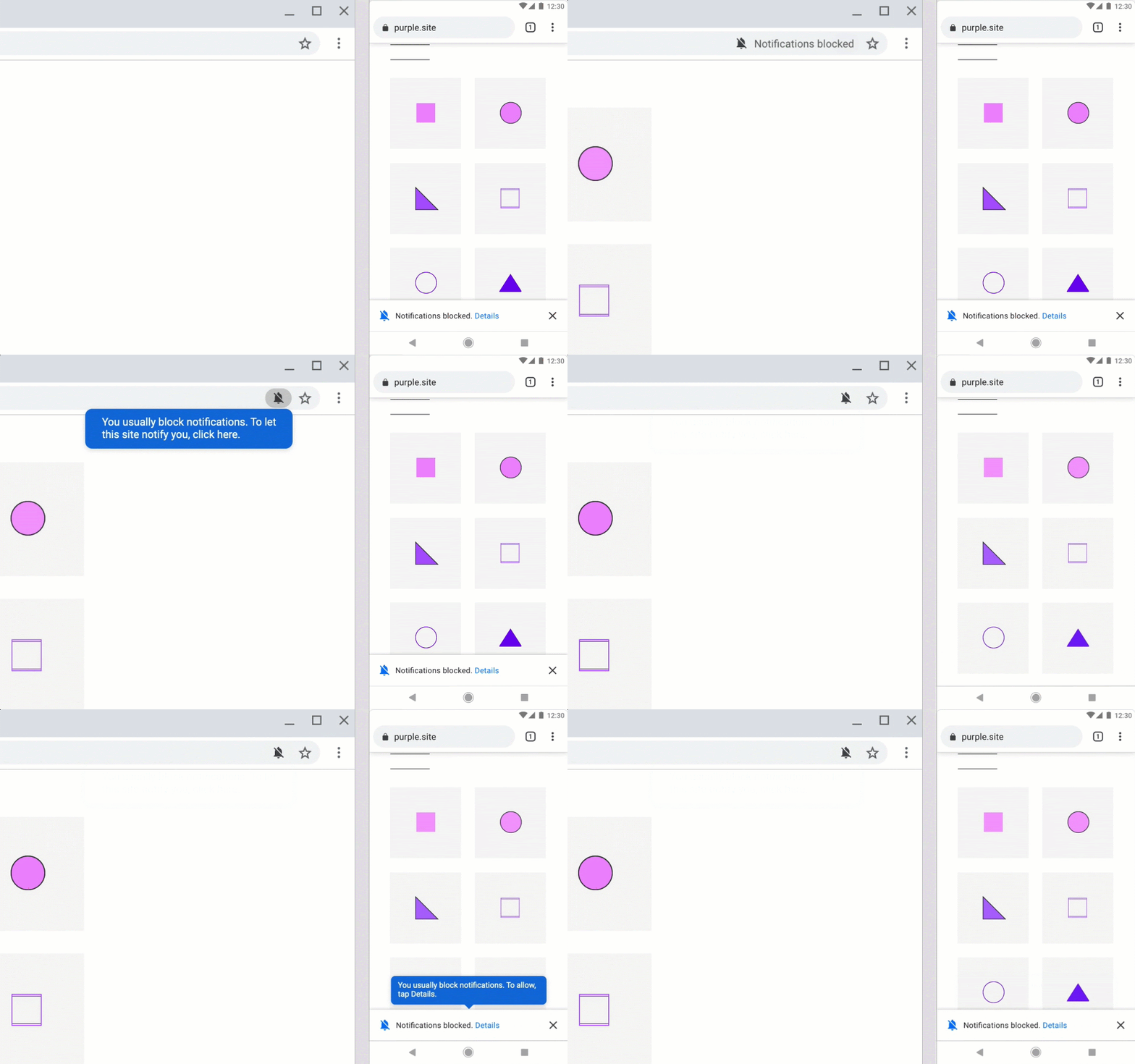
The quieter UI is available on both Desktop and Mobile.
Mozilla Firefox
Similarly, with Mozilla’s Firefox 70 & 72 updates, changes to opt-in screens and silent permissions were released in order to improve the user experience and make the web push an even more reliable communication channel.
Here’s a before and after look at the changes Firefox did
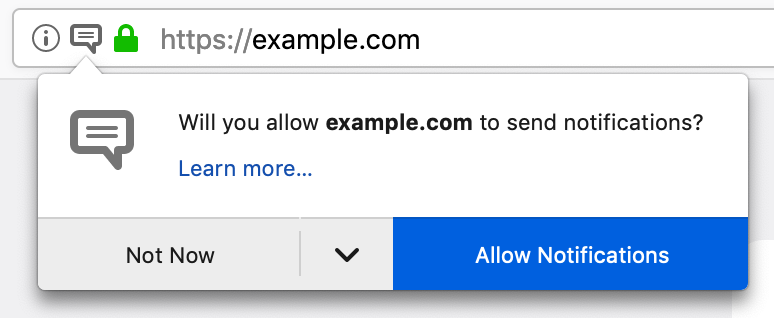
Before the update:
Whenever a user visits your website a default notification subscription form appears. It disappears only after clicking “Allow Notifications” / “Not Now” or by closing the site. If the user agrees, then he’ll automatically join the group of web push notification subscribers. If not, the opt-in screen will be displayed again the next time he visits the website. There is also a drop-down option to expand the form and click the “Never” button. After the user has clicked on the Never option, the opt-in screen will not appear again.
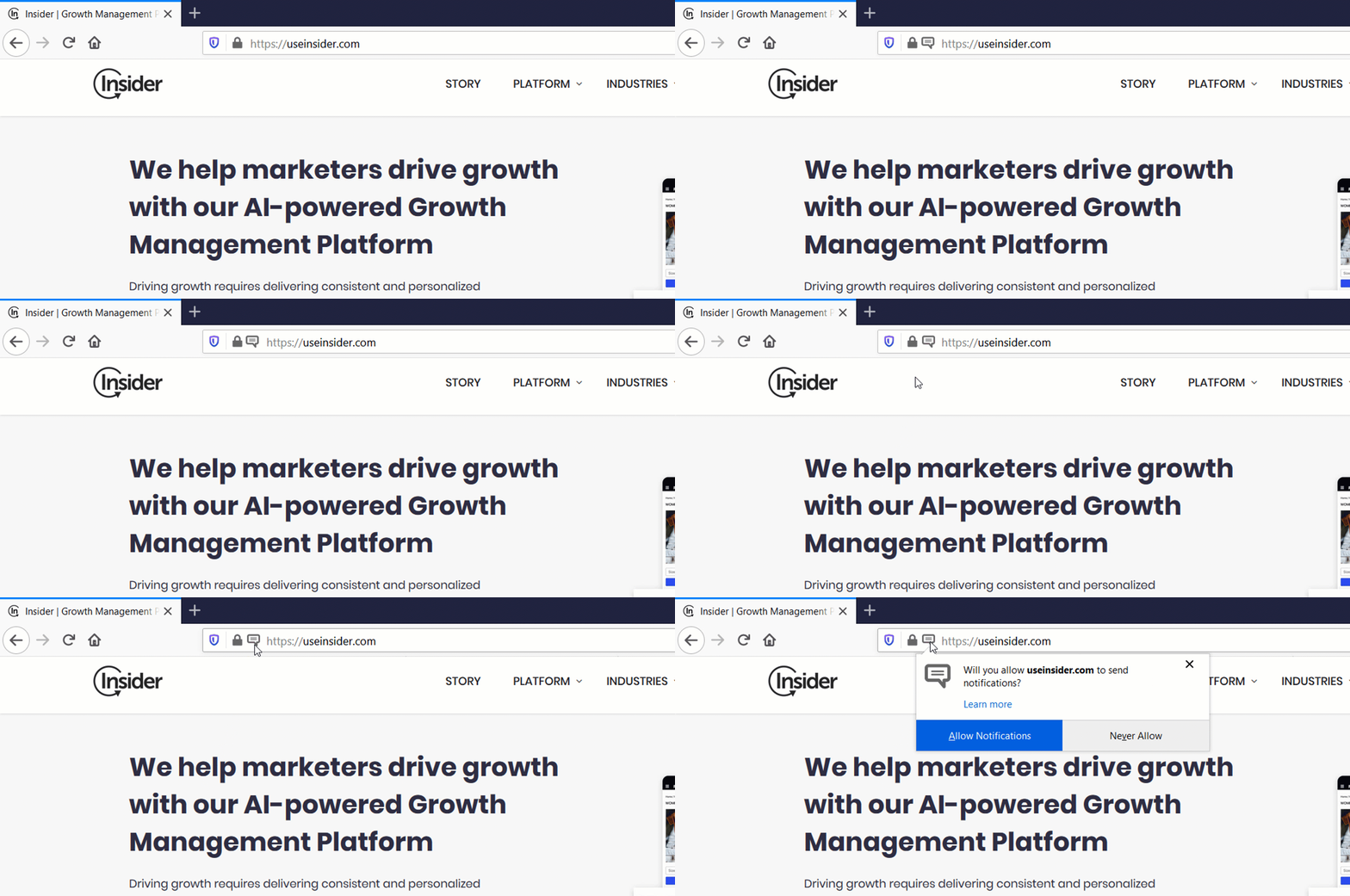
After the update:
After this update, there will be no default opt-in screen that’ll pop-up. Users can opt-in for notifications by clicking the icon on the address bar. The notification icon itself vibrates and draws the user’s attention in a subtle way. Also, in the new opt-in screen, the “Not Now” CTA has changed to “Never”. This means that the users who are not interested in receiving notifications will no longer have to click “Not Now” during each visit on any given website.
Which users will see the new Quieter Permission UI?
It depends! It is hard to say at this point which websites and which users get affected as according to Google, users can be enrolled for the new quieter UI in three ways:
- Manual Enrollment/Opt-out: Users can either enroll or disable the quieter UI by going into Settings. To enroll, the user needs to enable “Sites can ask to send notifications” in Settings > Site Settings > Notifications, and then check the checkbox “Use quieter messaging”.
- Default Enrollment for Users Who Repeatedly Deny/Opt-out: The quieter UI will be automatically enrolled and stay active for users who frequently either deny the permission or opt-out of notifications across various websites.
- Default Enrollment for Websites with Low Opt-in Rates: The quieter UI will be automatically enrolled for websites with very low opt-in rates. They will be unenrolled once their opt-in rates improve. For example, if the developer of the site improves the push notification opt-in permission request user experience.
What does it mean for my marketing efforts?
- Does this mean my opt-in rates will decrease?
Yes. You will see a drop in the opt-in rates. Since the new UI reduces the first time “Block” by users, the opt-ins will now directly translate into more qualified leads. - Will this affect my existing subscriber base?
No. It will not affect your existing subscriber base. Users who have already opted to receive push notifications will continue to receive them normally. - Will my engagement rates be affected?
Yes. Since the new users will be more qualified the engagement rates will increase gradually.
Contrary to the concerns you might have, we feel that this change can bring several benefits to your overall marketing efforts including
- An improved user browsing experience
- An uplift in push notification CTRs
- Reduce in first-time “block” of opt-ins
- Increased user engagement
How do you prepare yourself for this change?
One of the primary takeaways from these changes for businesses is to make their web push strategy more contextual. It would mean that marketers should start focusing on making the web push opt-ins more timely and relevant. At Insider, we are prepared to help you adapt to this new change with several smart ways that can actually help you amplify your push notification efforts.
- Event-based Opt-in Triggers: Since the main goal of introducing quieter permissions UI is to deliver a seamless web browsing experience, avoiding your website to automatically enroll for the quieter UI is crucial. You can trigger a personalized two-step opt-in screen based on specific user events such as product purchase, added to cart, add to wishlist, etc. This will help with getting opt-ins from users who have higher intent and allowing their permissions to receive notifications.
- Bell icon: The bell icon is an interactive and assistive button that floats on your website allowing your users to manage their notification permissions. Upon clicking the bell icon, users can either trigger the opt-in screen or an instruction screen that guides and directs users on how to opt-in.
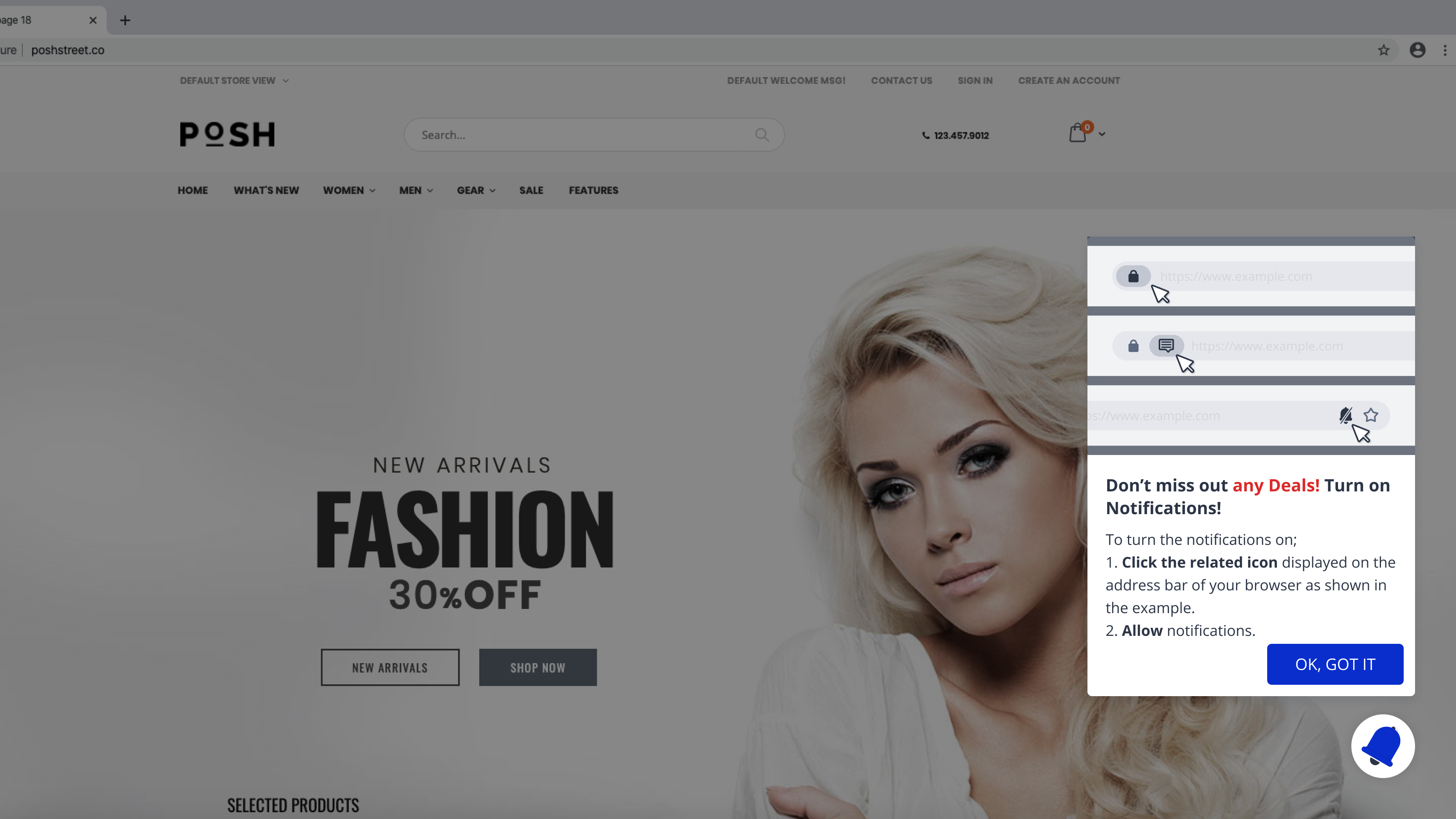
3. Opt-in Reminder template: A lot of users might get automatically enrolled for quieter permissions UI. In such a case, it will take some time for users to understand how to opt-in again to receive notifications. You can use an opt-in reminder template to prompt a user and guide them with the process of enabling permissions and opting to receive push notifications. This template can also be used to remind the users who have already blocked the opt-ins.
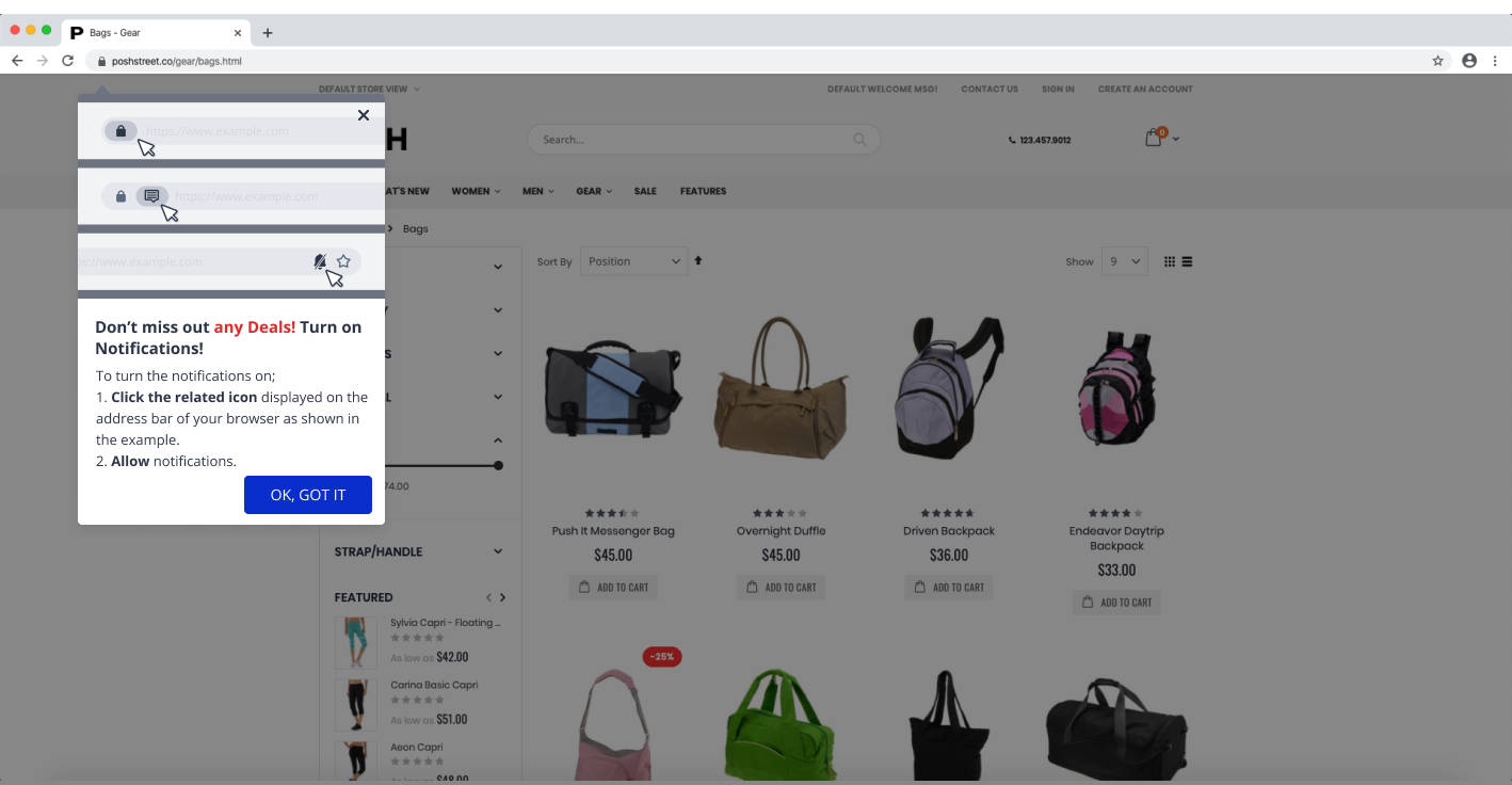
4. Delayed Opt-in screen to reduce instant blocks: Most users either block or opt-out permanently when asked for permissions as soon as they land on the website. Since quieter UI is built to address this concern, it automatically enrolls users with frequent deny/opt-outs and websites with low opt-in rates. There’s only one way to beat that — “improving user experience”.

You can delay and trigger your opt-in screen after the user has spent “x” amount of time on your website. This will help in reducing instant blocks and increase the user experience of your website.
5. Two-step Opt-in Template: Chrome has always supported two-step opt-in prompts. It not only improves the users’ experience but also offers more context as to why users should allow notification permission. You can use a two-step opt-in template to nudge users to understand the context of seeking permission for sending notifications. Once the user allows, you can then trigger a pop-up that’ll guide the user to manually opt-in for notifications.
#QuieterIsBetter: The Way Forward to Seeking Permissions
At Insider we are constantly working to introduce the best ways to increase your subscriber base and focus on improving your web user experience. We also strongly believe that this feature will lead to better push notification opt-in rates, higher CTRs and ensure a seamless browsing experience on your website.
While this feature may affect your opt-in rates, the reduction in your total subscriber churn would offset these concerns. In fact, this will help you build a more informed and loyal subscriber base whose intent to receive notifications of new offers, sale or content updates is higher which then results in improved conversion rates. Stay tuned for more product updates.

